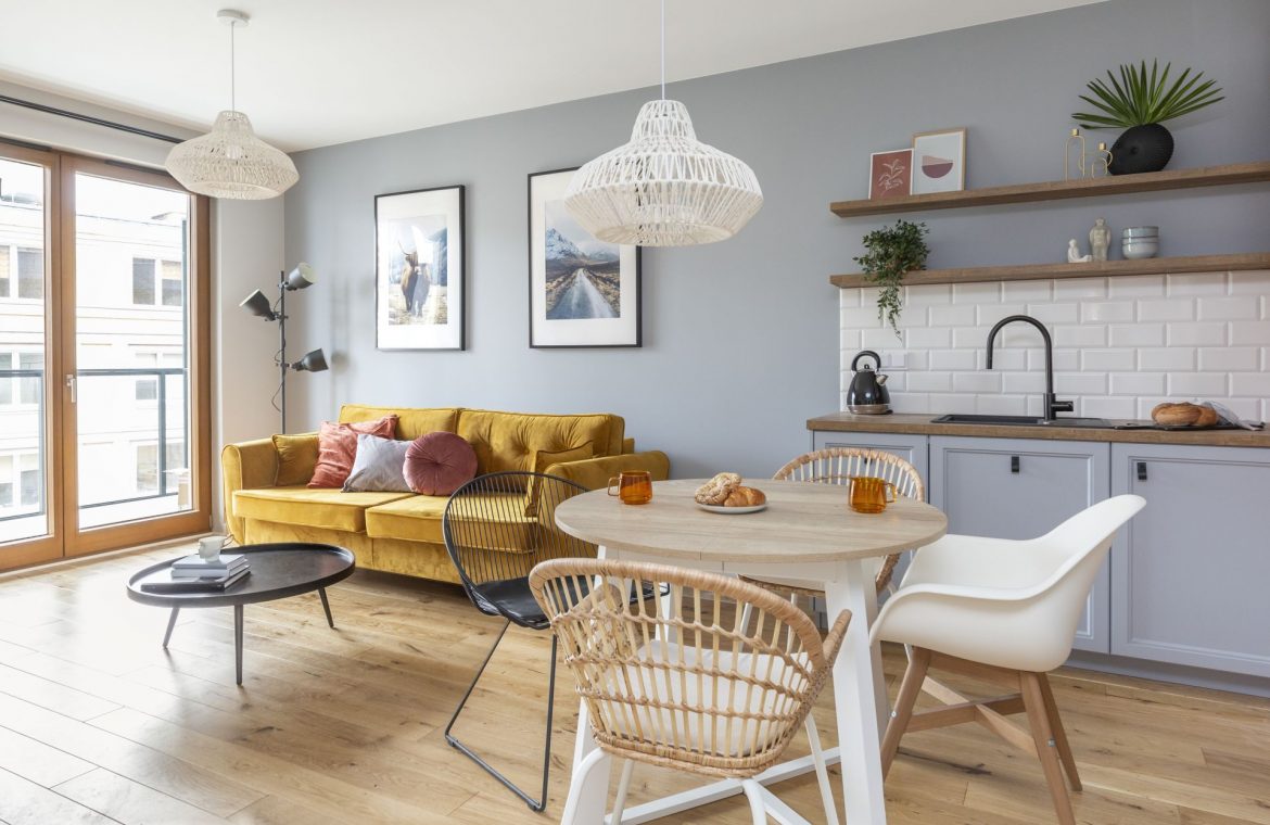
Rezydencja Barska is a modern and intimate investment that is ideally located – in old Ochota, at the intersection of Barska and Białobrzeska Streets. The prestigious location and elegant architecture of the building inspired Studio Decoroom, which commissioned investors to design an apartment for rent. In the future, the owner’s teenage daughter will live there.
Much of Ochota, which is considered one of the most attractive areas on the left bank of the capital, is occupied by parks and squares. The green pockets here are an adapted space for walking, sports and recreation. New residential buildings, harmoniously integrated with the landscape, are being built in the area, such as the aforementioned Rezydencja Barska. The dominant idea of the 41.5 square meter apartment for rent, designed by Ewa Dziurska and Katarzyna Domańska, was comfortable, hence the presence of materials such as bricks, oak wood and woven lamps. The colors for the living area and the bedroom have been chosen so as not to overwhelm the small space with too many colors and textures. In the case of apartments for rent, a neutral base turns out to be the best solution. Interior architects prepared a design based on investor expectations, and as a result, a functional and comfortable space was created, in which you want to spend time.
The apartment captivates with its matching colors. Gray is definitely dominant in it, here and there it is broken with more crucial accessories in the form of a yellow sofa or pink decorative pillows in the bedroom and in the living room. The sofa with a sleeping function in a pleasant upholstery in velor, thanks to its color contrasting with the rest of the apartment, is the main character in the living room. Displayed against a gray wall, the piece of furniture breaks the monotony of colors and enlivens the room. Braided lamps above the table in the dining room, in the living room and in the bedroom, pleasantly diffuse the light in many directions, giving the interior an interesting and personal illumination.
Kitchen with a brick in the background
There is a small kitchen next to two adjacent walls. In the cavity there is built-in furniture with a retro fridge, stove, oven and built-in hood. The second portion of the kitchen, by the wall next to the sofa, is a well thought out washing area, with a work belt next to it on either side of the sink. The matte gray kitchen furniture was complemented by milled facades with white brick tiles and a laminate surface in Sherman Oak. The simple construction fits perfectly into the current trends and harmonizes beautifully with the atmosphere of the rest of the apartment. “Point over i” are leather knobs that add elegance and combine the austerity of kitchen furniture with the softness of materials. They dilute the sharp corners of the buildings, emphasizing their class. The warm, smooth skin indicates a dark aquarium and faucet color. All in an interesting contrast to the red brick wall with a dark gray hinge connecting both parts of the kitchen. The development’s slightly harsh nature is warmed by an oak countertop in the shade repeated on the exposed top shelves.
black and white
The bathroom is perhaps the most expressive part of this apartment. It replicates the pattern of the entrance tile laid on the floor of the hall in the form of a rectangular “carpet” that protects the floor from dirt coming from outside. Thanks to its classic shape, the tile is a tribute to the past – the black and white combination in the bathroom is timeless and will not go out of fashion for a long time. The contrasting strong colors give this space a dynamic and modern look. The black and white squares of Vives Grafitto needn’t introduce anyone – they are classics of the genre. A simple pattern in the form of small triangles decorates the square surface of the porcelain stoneware. The walls placed on the floor and parts create a three-dimensional effect and depth, being a great shower wall decoration with metal brackets and round mirrors on a leather strap, reminiscent of the iconic model designed by Jacques Adnet for the luxury brand Hermès in the 1950’s.
The bathroom also has a hangout for a built-in washing machine and a pull-out laundry basket. As you can see, a small apartment does not have to be non-functional. The Decoroom project proves that there are many interesting ideas to make the small square very practical.
Interior design: Iowa Dzyurska, interior designer
Kitchen and furniture design: Katarzyna Domańska, interior designer


