GM is changing Logo. Does it matter to anyone? Oh yeah, and how.
Just in case, let me remind you what the logo looked like before the changes:
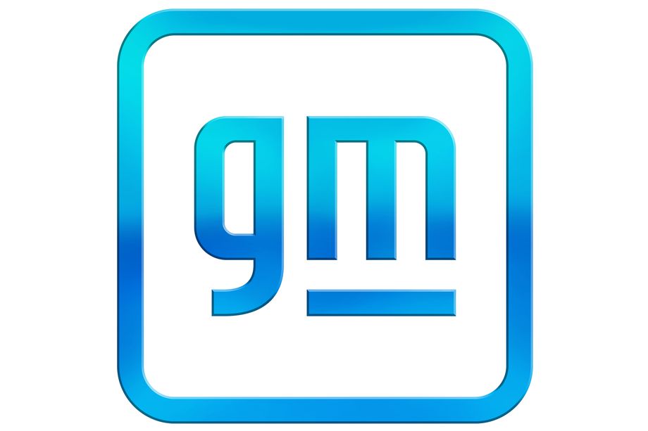
However, it currently looks like this:
They changed it, they changed it, why go so deep into it? And a change is much greater than at Opel, as there are no microscopes powerful enough to notice the change. Oh, terrible ignorant people. You have no idea how much content is behind these seemingly insignificant changes. You don’t know how extremely important it is and how much change in the logo drastically changes the company’s reception among clients.
GM Changes Logo: Group Interpretations
We the idiots who don’t understand the power of logos don’t know why the GM logo has changed so much. Fortunately for ignorant people like us, the PR department has explanations.
First of all, the blue gradient symbolizes the clear blue sky that we will be able to enjoy with electricity supplied to GM cars. So far they do so on average, because they get the best of pickup trucks and SUVs with six-liter engines. Underlining refers to a new electrical architecture using Ultium batteries, and a new M design makes the space between the letter and the underline look like an electrical plug. Moreover – now there will be a translation from English – “The new motto is optimistic, conveys energy and joy, and reflects our vision for the future. It continues to build our strong heritage with consistency and trust as the main characteristics. But most of all, it gives our company a human face.” Now you know everything.
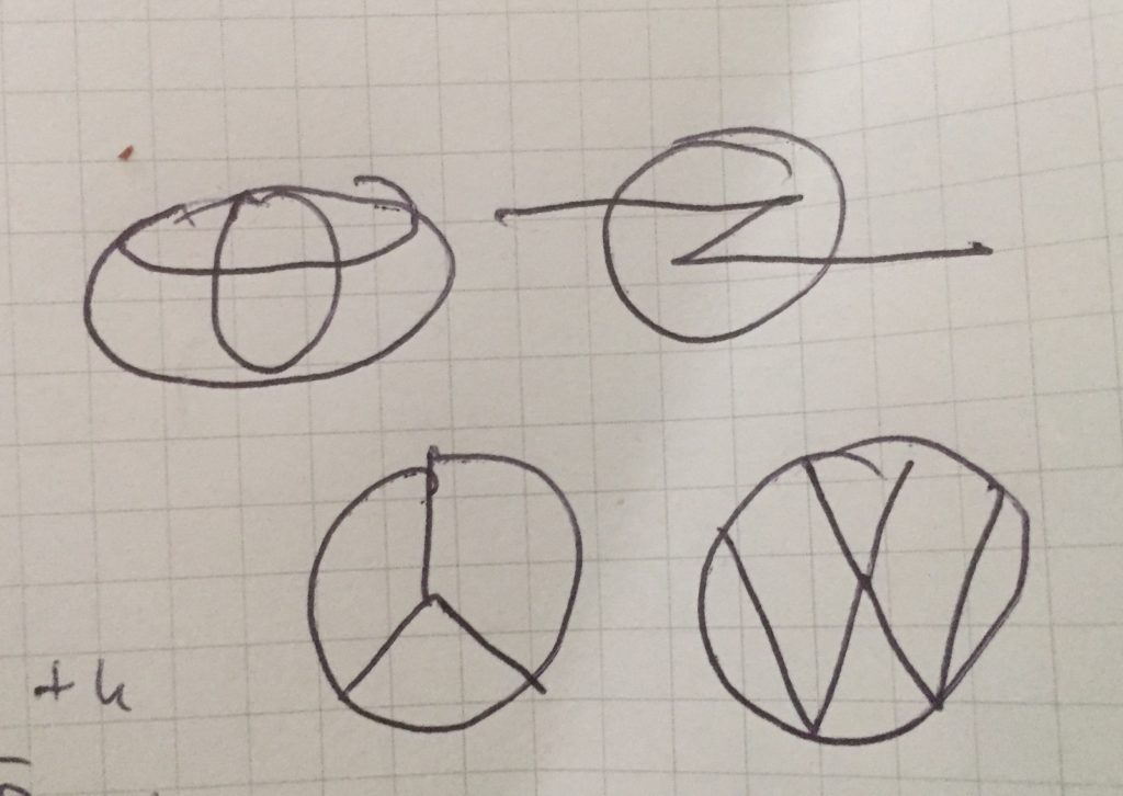
I do not deny that the slogan matters. It is very important, even important, it allows you to get familiar with the product and immediately know whether you want it or not. For example, I see the logo … and I know right away that I’ll thank you. On the other hand, subtle changes, such as a thinner streak or removal of a shadow, are not important because they do not alter general perception. I can take a pencil and draw some patterns and everyone will know what’s going on.
This is the power of a logo. It is an instantly recognizable symbol. The cosmetic changes that have followed the sublime translations are nonsense. It doesn’t have a double bottom, and it doesn’t serve any purpose, except for indicating that you are doing something and getting media attention. Changing the logo only makes these poor internet portals write about it and thus give ads to Opel or Volkswagen for free. As it works, you can expect a real influx of insignificant logo changes. We’ve been watching him for some time.
Are there cars already carrying the GM logo?
The funniest thing is that the GM logo is only a company logo, because there are no cars with the GM logo on the hood and it doesn’t matter anymore – but you definitely spent a lot of money on that account, paid yourself some generous bonuses, and a designer got GPU is over a million dollars, but that’s most likely because he’s a fellow president from college. The GM logo appears on spare parts – perhaps thanks to the rebranding, people are more likely to buy blocks or oil from this brand.
Meanwhile, there are many opinions that this slogan looks like it did 10 years ago. Well, knowing GM, that could be how long the business has been.

“Music specialist. Pop culture trailblazer. Problem solver. Internet advocate.”


